Teachers Health - Modernising Health Insurance Onboarding
Teachers Health is a restricted health fund providing health insurance for union affiliated professionals in education, university education, and nursing.

Role
Senior Experience Design Consultant @ Thoughtworks
Client
Teachers Health
Project Length
4 Months
🔒 NDA
This project has not yet gone to market, final and high fidelity designs will not shown. The focus will be in strategic work.
My scope:
I led the complete redesign of Teachers Health's digital sales and conversion experience. This encompassed the entire journey from eligibility verification through to post-purchase communications across three sister brands: Teachers Health, UNI Health, and Nurses Health.
Working with senior leadership across the entire business. I was responsible for transforming a 1990s-era digital experience into a modern flow capable of supporting their ambitious 4-year growth targets.
Strategy and Approach
I joined the the project after an initial discovery phase, and found it was lacking a fair amount of foundational research. The Discovery that had recently concluded was focused on business vision but had ignored the business reality of how they currently function, how their systems interact with their departments, and competitor analysis.
My Response
I flagged these gaps immediately, but was unable to get the time line extended. I asked for additional resources and was able to hire a junior experience designer, to help me design and research.
Experimental VS traditional
With a newly imagined vision Teachers Health wanted to experiment with different and new solutions. One of those was to split the traditional onboarding journey into two parts; Stage 1: Quotation and Stage 2: Setup. This new conversion funnel is meant to bring the point of conversion closer to the beginning of the journey just after an initial quotation and then personal information can be filled out later at the users leisure, and is more similar to the process seen when applying for a bank account.
Testing
While the business encouraged us to test their new approach, I thought it had few issues and that our tests would also benefit from a comparison with a more traditional journey. I also used this testing opportunity to evaluate to reassurance messaging play a role in trust. We tested 4 journeys with 24 participants, cross education, health and age brackets.
Traditional VS Experimental
We found the vast majority didn't understand the new experimental version with only 3 users correctly explaining what they were seeing and what they expected the next steps to be. Of those three who could correctly identify the process, only 1 of them saw it as a benefit. our other uses preferred to do it all in a single sitting. With how health insurance works it is understandably very important to users that they have no gaps in their coverage and many were worried they would forget to get it up or simply not understand that additional steps were needed and when it came time to use their insurance they would be ineligible for service.
Reassurance
We also tested how trust factored in to the decision to convert across both the traditional and experimental journeys. We did this by adding messages of reassurance across the journeys. These were small banners containing things like; cooling off periods, physical store presents, mobile app, and adding more clarity and email comms around what happens next. When we compared the likely hood for our test participants to sign up, users who went through the reassurance flows were 60% more likely to mentioned trust unprompted and directly called out at least one of these banners as a reason they would consider Teachers Health.
Our user tests clearly demonstrated that the users didn't want or understand the experimental user journey. Preferring a journey that is more traditional. Presenting our findings back to the senior leadership who had their sights set on an onboarding process that would set them apart from others in the industry was tough, but they did accept it after reviewing the findings. This allowed me and my team to refocus on the traditional journey.
Design Process
Now that we had validated our design approach it was time to get our initial test version ready and uplifted from feedback from our users, ensure it meets the requirments for the current legacy systems, and hone the design.
While there were major plans to not only redesign the front end of the process, but also the back end and systems that it would interact with I was tasked with creating a design and journey that could be easily updated and changed as these other improvement were developed over the next few years.
Design system and tokens
I started by tokenising the design system so that Teachers Health and it's sister brand could easily and quickly update their brand colours and components across all the brands a journeys at once. This also allowed us to set up instances in Figma where we could drag our screens into different brand environments to see what they would look like.

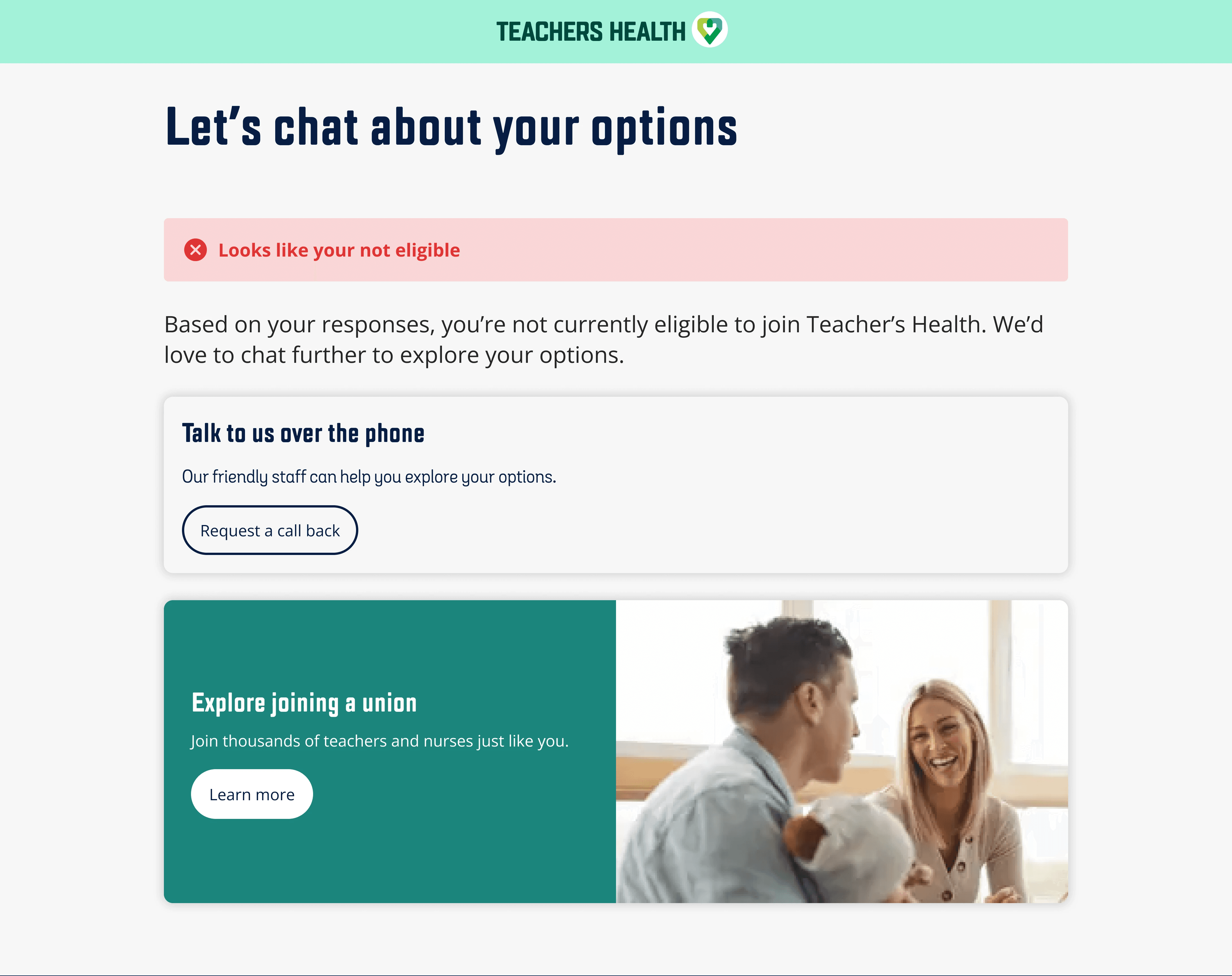
Eligibility confusion
Impact and Results
I left the project after about 6 months, having delivered an end to end journey for responsive web and mobile. At the time when I was leaving there had been considerable set back on the development side and the environments had yet to be set up. Unfortunately this meant I have no real data or metrics on how the process preformed.
Reflections
Use a scalpel not a hammer
Transformation projects like this may feel and be presented as a greenfield, however legacy systems that hold it all together are complicated and essential to running the business. Coming in with a hammer to jam in new processes, is more likely to break existing workflow leading to angry stakeholder. Having a comprehensive understanding of how their current systems work is time consuming but is a much better approach to gathering stakeholder buy in, and to ensure you don't break the process along the way.
Validating assumptions
Whenever you build new processes, there are always assumptions. Often there is a push to move quickly which can mean that those assumptions aren't validated or are overlooked. User testing is key to ensuring that you build something that user want and understand. The user tests we conducted during this project helped us to catch are critical assumptions to put us on a path to build a solution that our users wanted.